The Alien Invasion of Eugene or U-G-L-Y, You Ain't Got no Alibi! (Psst, these photos were illegally obtained!!)

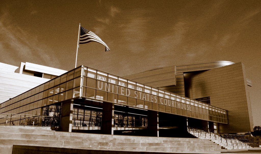
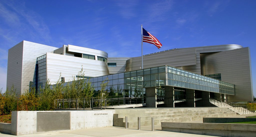
I may be just a lowly architecture student who has many more years of training ahead of her, but I think I have some right to speak my mind about the new federal courthouse in Eugene. Yes, I think it is ugly. To me it looks like a creature from outer space has dropped down out of the sky and plunked itself in the middle of our city. Let me try and back up my conclusions with the observations I made last weekend when I photographed the thing.

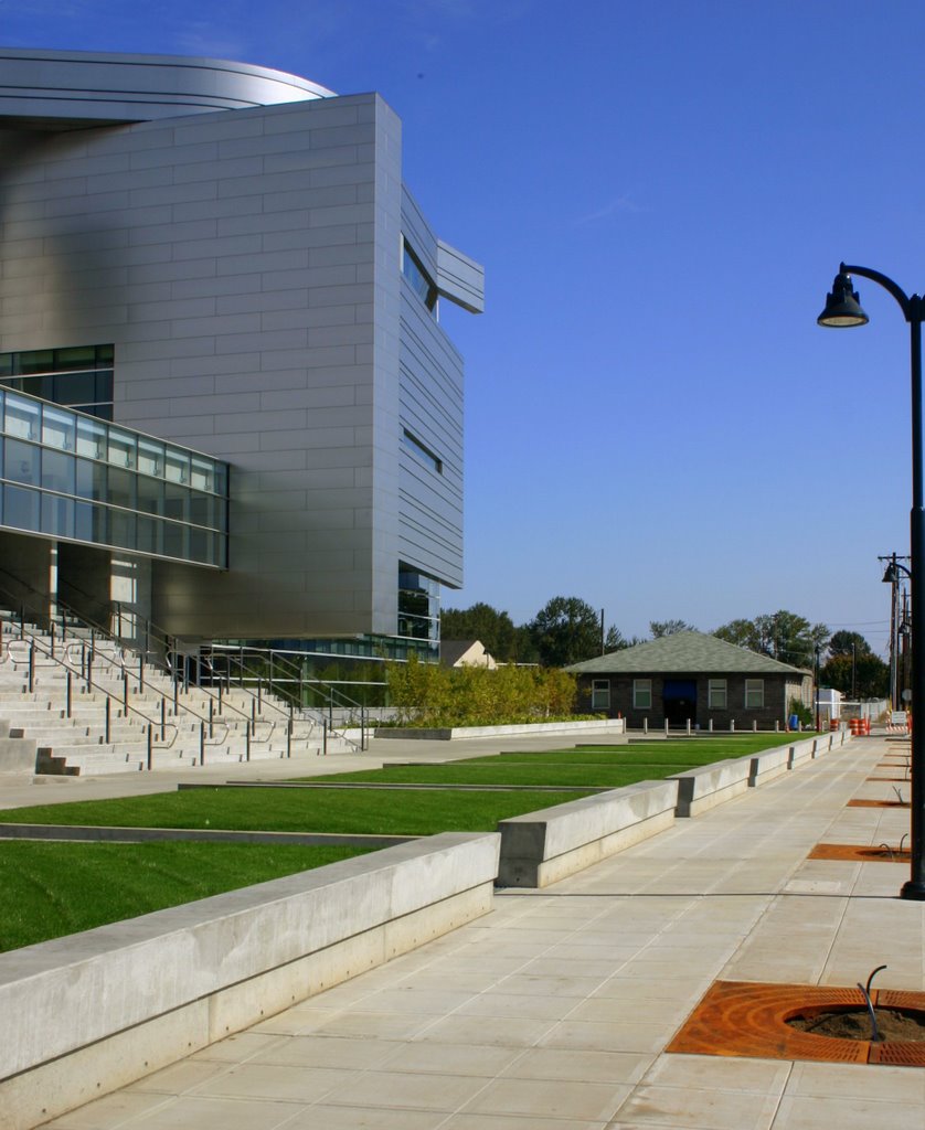
The building is essentially an aluminum box with reflective mirrors that are quite blinding on a sunny day. The architect has tried to break up the box with various curves near the roof. I find the form overwhelming and disorientating. In my opinion, this building has only one good view- the one above. What happened to building on all four sides? When he made the model, was the architect always presenting it from one view point? Did he not notice the unbalanced look? This thing turns it’s back on the river, the same river that our city has been trying to connect back to for decades through various urban renewal proposals. This building acts as if it is the most important thing in the city and nothing else matters. Yeah, that’s architecture I want to build (I hope you can hear the sarcasm).

On the west side of the building, a huge concrete berm (see security design) holds a collection of trees and shrubbery. These trees will get quite tall in time and effectively hide this side of the building. Why would an architect take all that time to generate something only to hide it in the end?
The courthouse looms over the Eweb property, and various light industrial buildings. It makes no attempt to mirror the values, attitude, history or architecture of Eugene. It also borders the edge of Franklin (a major boulevard where pedestrian crossing is truly impossible), and is cut off from the rest of the downtown area by anything other than a motorized vehicle (but even then, it gets a little tricky).

While photographing the courthouse, I was approached by a security guard (mind you this was on a Sunday and the building was not officially open at that point) who told me I’d just broken some federal laws. Apparently it is illegal to take pictures of a federal building while standing on the property. He said I could take them across the street (or I suppose in the middle median if I felt like risking my life and shuffle through the traffic like a game of frogger) but I could not be anywhere on the actual block that the building is. So I packed up and left. He followed me around the perimeter of the building to my car and then said “Well you don’t have to leave, you know..” Um, yeah I was just ordered off the property? What is my reason for staying again? Am I supposed to get all defiant in his face or what?


In light of 9/11, new public construction is showing a propensity towards more concrete, more barriers, and more security measures all around. I’m totally for that, but could we just try and blend it in a little more than this??

The next week I was attending my architecture class and listening to my very talented professor talk about the importance of the context in which a building is placed. He stressed that a building should reflect the history and values of its users. It should blend into its surrounds while retaining a gentle uniqueness to its form. He specifically mentioned the courthouse during this lecture and he too used words like alien, foreign, out of place, etc... He knows the architect personally and he asked him why the building was not placed in relation to the context (community) that it was placed. The architect answered that it was not the job of the building to do this- it was the job of the city and the people. Essentially he is claiming that we must conform to his extraterrestrial design and not the other way around. If that’s not a pompous answer, I don’t know what is.
I say this is War of the Worlds and we need defend our community from architects who reside on their own puny self-centered planets.

3 Comments:
It's ALMOST as bad as Martian archetechture...
see more at http://www.aoleonthemartiangirl.com
-Aoleom
In a different place, I might like it, except for that weird fin-looking thingy sticking out of the top.
I think maybe they built it so it could be used in some sci-fi movie or something. Bring in some Hollyweird dollars.
Absolutely beautiful. It's odd that people are so opposed to creative expression in architecture. They want it to look like we were never here; make it look like everything stopped a hundred years ago.
If they'd built a building that looked like 1927 you wouldn't have this post. Or you might extol it's beauty.
This will inspire our children for what's possible, to think different, be creative - wonder.
I like it.
Post a Comment
<< Home